 Simon Prickett

Global warming is a thing, and we can all do our bit by reducing our carbon footprint. One way of achieving this would be to move more things that we use electricity for (cooking, charging electric vehicles, washing clothes etc) to times when our electricity generation was as green as possible. To do this, we’d need a way of knowing when those times are so that we could take manual or automated action.
In the UK, we have a free API that provides information about current and forecast “carbon intensity” for electricity generation. I decided to see how easy it would be to build a display that uses this.
Here’s the definition of carbon intensity that we’ll use here (source):
CO2 emissions related to electricity generation only. This includes emissions from all large metered power stations, interconnector imports, transmission and distribution losses, and accounts for national electricity demand, embedded wind and solar generation.
The API was developed by the UK National Grid ESO, in partnership with the Environmental Defense Fund Europe, University of Oxford Department of Computer Science and WWE. Read more about it on the Carbon Intensity API website.
I wanted to build something that would display the current carbon intensity for my local area in a way that I could glance at it and know if it’s high or low, or take a longer look and see some detail. I also wanted to have the ability to control other devices if I chose to in future.
Your support helps to fund future projects!
Pimoroni’s excellent GFX Pack is ideal for this task. It’s a 128 x 64 pixel mono LCD display with multicoloured backlight and five buttons all in one unit. It is designed to attach to and be powered/driven by the Raspberry Pi Pico microcontrollers. By pairing this with a Pi Pico W (built in WiFi) I had an all in one unit that could connect to the network, call the API, then interpret and display the results both as a graph and as a glanceable summary using different colours for the backlight. The GFX pack also has a Qwiic/STEMMA QT connector that will allow me to connect / control other things in future. Perfect!
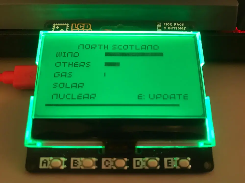
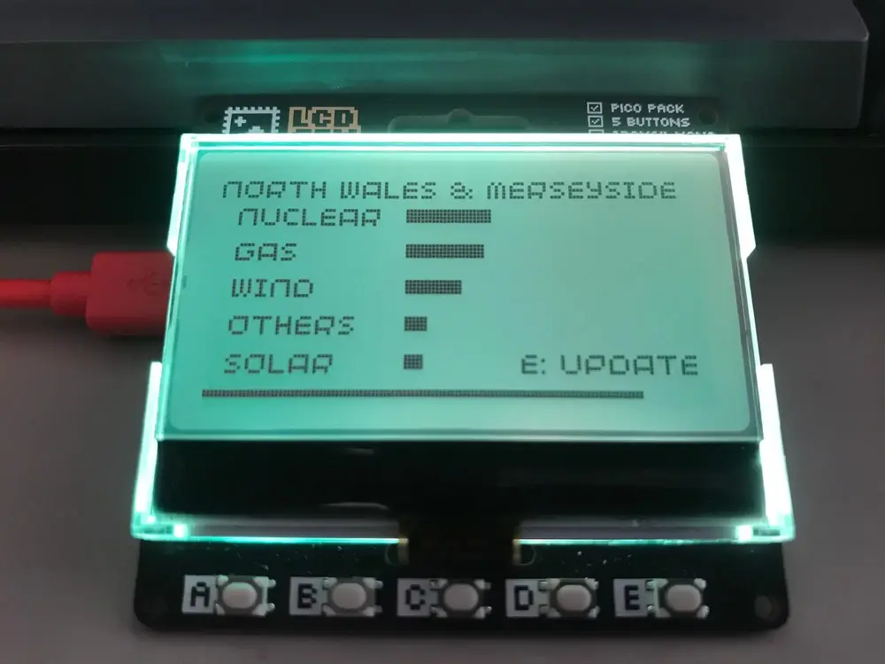
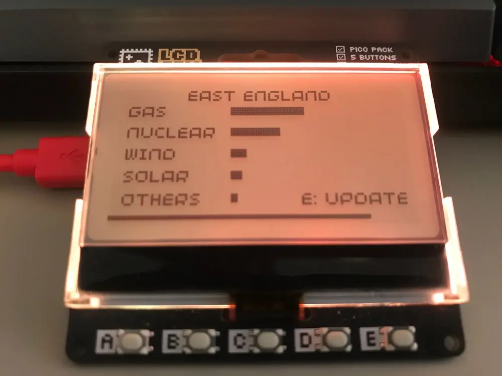
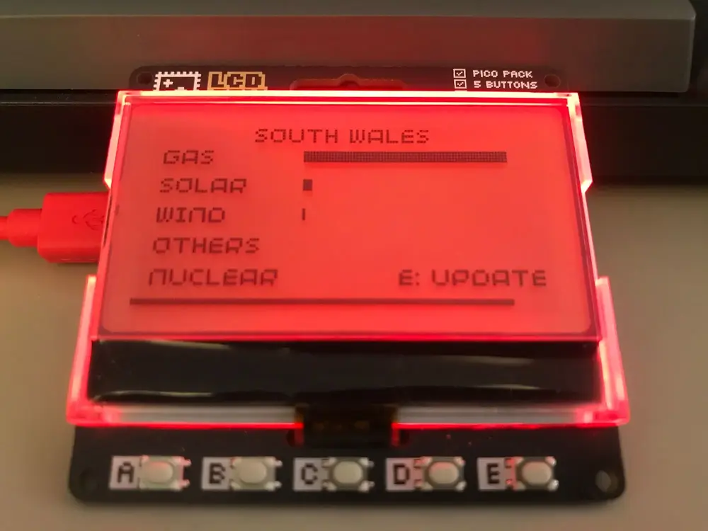
Here’s a quick demo of the final MicroPython script running on the GFX Pack. It wasn’t a particularly good day for carbon intensity in the East Midlands region, so the backlight is red!
The display updates either automatically when the countdown bar across the bottom reaches the left hand corner, or manually whenever the “E” button on the GFX Pack is pressed.
Here’s some examples of the script running at different times / for other regions to show off some of the different colours used:
The hardware I used to make this can be seen below.
The Raspberry Pi Pico W needs to have headers attached to it (I bought mine with this already done - alternatively you can get the headers separately and solder them on yourself). Then, assembly is simply a matter of lining up the Pico W with the connector on the GFX pack and pressing the two together. The GFX Pack has a handy outline of the Pico imprinted upon it, showing which way the Pico’s Micro USB port needs to face to attach it correctly.
I’ve included links to each of the items above in the “Resources” section at the end of this article. This includes the source code, which I donated to Pimoroni’s examples repository here. In this article, I’ll show you how the code works and how to install it on your own hardware. I’ll also demonstrate how to call the API from a web page, in case you want to use it for other purposes.
Installation and Configuration
Assuming you have built the hardware (attached the headers to the Pi Pico W if needed, attached the headered Pi Pico W to the GFX Pack) here’s how to get a copy of the script, configure it for your network and local area then install and run it.
To begin, download the latest MicroPython firmware image from Pimoroni here. You want the file named pimoroni-pico-vX.XX.X-micropython.uf2 where X.XX.X is the latest release number. These files are located in the “Assets” section of the page and at the time of writing the latest version was 1.20.4.
Once you’ve downloaded the .uf2 file, it’s time to flash it onto the Pico W. Plug the Micro USB end of your cable into the Pico W. Hold down the “BOOTSEL” button on the back of the Pico W and connect the USB A end of your cable to your machine.
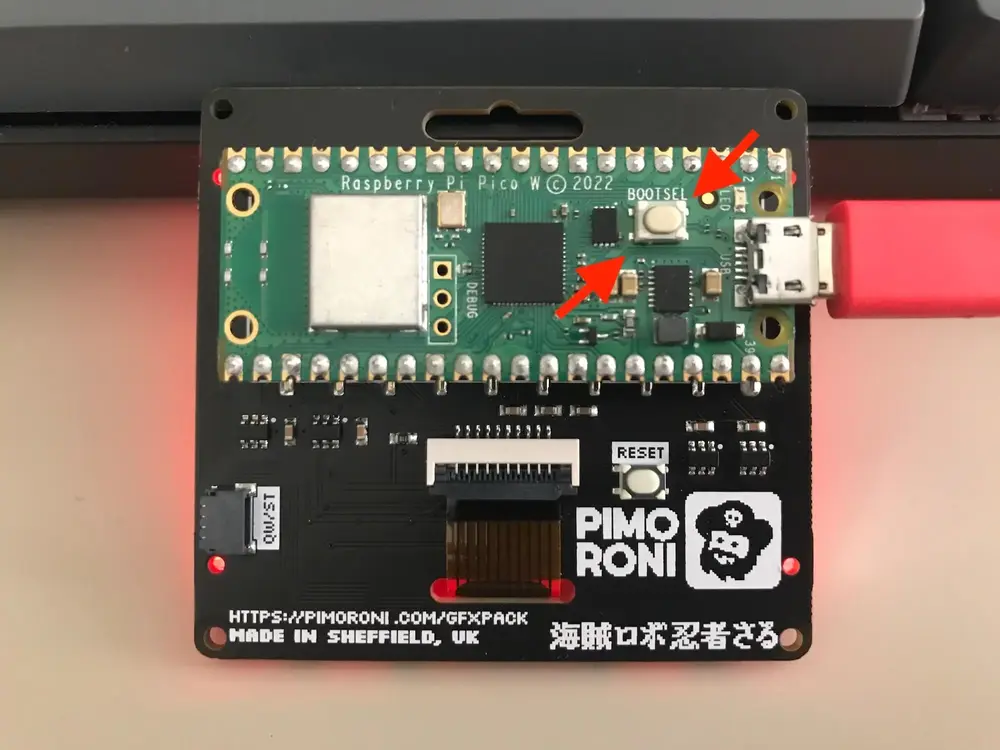
The Pico W should appear as a removable drive named “RPI-RP2”. Open this drive and drag and drop the .uf2 file onto it. Once the file has copied to the drive, it will unmount itself and you should have MicroPython installed. We’ll check this has worked shortly. Meantime, leave the Pico W connected to your machine.
Next, get a copy of the Python script and all of the other examples for the GFX Pack and other Pimoroni Pico products by cloning their GitHub repository to your machine. At the terminal enter this command:
git clone https://github.com/pimoroni/pimoroni-pico.git
If you don’t have the git command line tools installed, just grab the repository as a zip file from GitHub here and unzip it somewhere on your machine.
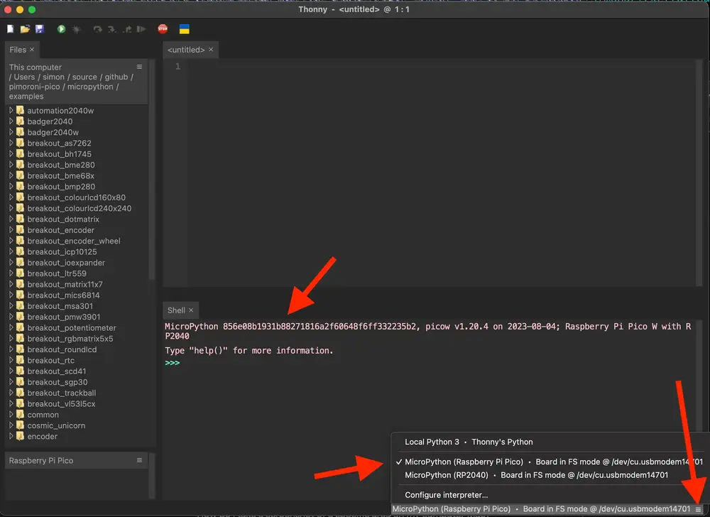
Now, start up the Thonny IDE or download and install it first if you need to. Once it’s running, use it to open the folder pimoroni-pico/micropython/examples (located wherever you downloaded / cloned the repository to on your machine).
Then, connect to your Pi Pico’s MicroPython runtime by clicking the hamburger menu in the bottom right corner to select a Python interpreter. Pick the “MicroPython (Raspberry Pi Pico)” option. You should see the REPL appear in Thonny. Python code typed here executes immediately on the Pico W:
Install the code by uploading these files to the root or “/” of the Raspberry Pi Pico W:
common/network_manager.pycommon/WIFI_CONFIG.py
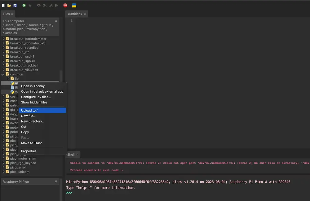
Next, still in Thonny, right click on the file gfx_pack/carbon_intensity.py and select “Rename”. Rename the file to main.py, then right click that and upload it to “/” on the Raspberry Pi Pico W in the same way as you did with the other files.
Before you can run the code, you’ll need to configure it to be able to connect to your WiFi network. Double click “WIFI_CONFIG.py” in the “Raspberry Pi Pico” section of the Thonny editor. This opens the file stored on the Pi Pico W for editing. It will look like this:
SSID = "YOUR_WIFI_SSID"
PSK = "YOUR_WIFI_PASSWORD"
COUNTRY = "YOUR_COUNTRY_CODE"
Replace the values of SSID and PSK with your WiFi network’s ID and password, and set the value of COUNTRY to your ISO 3166-1 alpha 2 country code (GB for United Kingdom). If you need to look this up, here’s a table of values on Wikipedia. Save your changes.
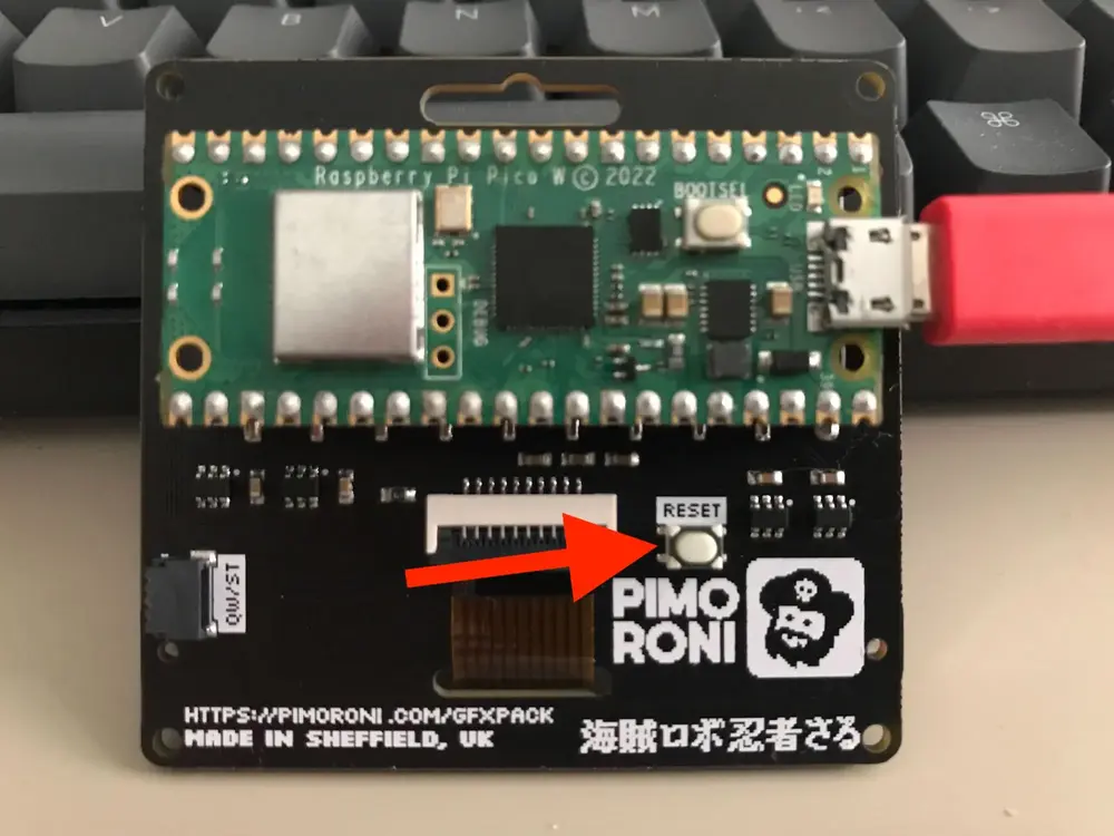
All that remains is to press the “RESET” button on the back of the GFX Pack…
The device should restart and if all is well it will connect to your network, call the API and display the results! If not, reconnect Thonny and try editing the WIFI_CONFIG.py file to make sure the correct values for your network are in there.
If nothing at all happens and the display doesn’t even light up, make sure that you renamed carbon_intensity.py to main.py before copying it across to the Raspberry Pi Pico W.
How it Works
Let’s go through the MicroPython script and see how it works. Here are the distinct pieces of functionality that it implements:
- Managing the screen display and clearing the screen.
- Connect to the WiFi network.
- Retrieve data from the API.
- Display the data as a graph.
- Refresh the data after a period of time has elapsed, or immediately when the user presses one of the buttons.
We’ll look at each of these in turn.
Managing the Screen Display and Clearing the Screen
Pimoroni provide a library called Pico Graphics to help developers work with the various types of screen / display that they offer for the Raspberry Pi Pico or RP2040 powered devices.
This library presents a set of high level functions for “drawing” on the screens with “pens” that can plot individual pixels, write text, draw “shapes” and many other things.
We’ll use a global variable display as our entry point to the Pico Graphics library:
from gfx_pack import GfxPack, SWITCH_E

...

gp = GfxPack()
display = gp.display
From here, we can ask what size display we’re running on:
DISPLAY_WIDTH, DISPLAY_HEIGHT = display.get_bounds()
These dimensions are essentially constants as we’re always running on the GFX Pack which has a fixed resolution. I’m using the library function anyway to make it easier to port this code to other Pimoroni displays in future (or if you want to do that yourself).
As the GFX Pack is a monochrome display, Pico Graphics pens work as described in the monochrome mode section of Pimoroni’s documentation. In short, we’ll use pen 15 whenever we want to draw anything, and pen 0 to erase things back to the background colour.
For example, a clear screen function looks like setting the pen to 0, using that to clear the screen with, then going back to pen 15:
def clear_screen():
    display.set_pen(0)
    display.clear()
    display.set_pen(15)
Drawing a filled rectangle on the screen is handled by the Pico Graphics line function. This takes two sets of x,y screen co-ordinates and a height of line / thickness of pen parameter:
display.line(start_x, start_y, end_x, end_y, height)
We’ll be using this to draw bar graphs and countdown timer bars.
Pico Graphics also handles text and fonts for us. I’m using the default font but you can configure others.
Text is drawn on the screen using the text function, at a given x,y co-ordinate. It can also be scaled and set to word wrap after so many pixels. Throughout this example, we’ll use a scale of 1 and a word wrap position of the display width.
Here’s the code to draw some text centered on the screen:
def display_centered(text_to_display, y_pos, scale):
    width = display.measure_text(text_to_display, scale)
    x_pos = (DISPLAY_WIDTH - width) // 2
    display.text(text_to_display, x_pos, y_pos, DISPLAY_WIDTH, scale)
    return x_pos
The Pico Graphics function measure_text is used to determine how many pixels the text to display requires given the current font and scale. We then use that to work out the x co-ordinate to draw the text at.
Note that no changes appear on the screen until we refresh it using display.update() (also a Pico Graphics library function). In this way, we can compose a set of changes to display on the screen, and show them when we’re done.
Pimoroni’s GFX Pack library provides a function to set the colour of the backlight. This expects RGBW colour values, and the change takes effect immediately. Example code:
from gfx_pack import GfxPack

...

gp = GfxPack()
gp.set_backlight(r, g, b, w)
Connecting to the WiFi Network
As there’s no operating system running on the Pi Pico W, we need to handle some tasks that an OS would normally perform for us. One of those is establishing a connection to the WiFi network so that we can call the API.
I knew I would be donating my code to the Pimoroni examples repository, so I looked at how they handle this common task in their other example code for the GFX Pack.
Pimoroni provide common code for managing WiFi network credentials and connecting to the network. We copied this code to our Pico earlier (the files common/WIFI_CONFIG.py and common/network_manager.py from the Pimoroni repository that we cloned). We need to import them for use in our MicroPython script:
import WIFI_CONFIG
from network_manager import NetworkManager
The file WIFI_CONFIG.py contains the SSID, password and country code for the network we’re connecting to. Treat this file like a secret, and don’t commit it to GitHub!
SSID = "YOUR_WIFI_SSID"
PSK = "YOUR_WIFI_PASSWORD"
COUNTRY = "YOUR_COUNTRY_CODE"
The network connection is established at the start of the script, by calling Pimoroni’s network manager, passing in details from the WIFI_CONFIG and the name of a function to handle progress updates (status_handler). I kept the status handler simple, so that it just displays basic update information as the connection is established. Check out the source code for that on GitHub if you’re interested.
network_manager = NetworkManager(WIFI_CONFIG.COUNTRY, status_handler=status_handler)
uasyncio.get_event_loop().run_until_complete(
    network_manager.client(
        WIFI_CONFIG.SSID,
        WIFI_CONFIG.PSK
    )
)
Once the connection is established, we can assume we are connected to the internet and go ahead and do other things. I didn’t add any code to handle the network credentials being incorrect or other network errors - you can just reboot the device if those occur :)
Retrieving Data from the API
In order to display data, we need to get some from the API first :) I’m using the GET /regional/postcode/ endpoint that expects a postcode area as the final part of the URL.
If we were at the Pimoroni HQ, our postcode area would be S9. I used a variable to store the URL so that you can easily edit it and swap in your own postcode area - one in my local area is NG1:
CARBON_INTENSITY_URL = "https://api.carbonintensity.org.uk/regional/postcode/NG1"
The API doesn’t require any authentication tokens, sign up or special HTTP headers, so we can use the urequests (MicroPython version of Python’s requests package) to make the call like so:
response_doc = urequests.get(CARBON_INTENSITY_URL).json()
Here’s what the JSON document that we receive back from the API looks like:
I decided to use these data items on the display:
data[0].shortname(e.g.East Midlands) - the region that the data is for.data[0].data[0].intensity.index- text description of the carbon intensity at the time e.g.very high. I wanted to use this to set the backlight on the display, with lower intensities showing as greens, then moving up to yellow, orange and red as the value gets higher.data[0].data[0].generationmix- an array containing objects. Each object has two keys -fuelfor the energy source e.g.coal,windandpercfor the percentage of the overall mix that the source comprises. The API doesn’t sort the array in descending order of percentage, nor does it have an option to make it do so. This feels like it’s missing some basic functionality but we’ll fix that in the MicroPython. (2025 note - we’re done with coal in the UK now so don’t expect to see that any more!)
Having retrieved the JSON document, I pull out the region name and intensity index text into their own variables:
region_name = response_doc["data"][0]["shortname"]
intensity_index = response_doc["data"][0]["data"][0]["intensity"]["index"]
Then all that remains is to retrieve the energy source and percentage mix data from the array of objects. Given the limited space on the display, I decided to show values for solar, wind, nuclear and gas… plus a value for all of the other sources combined:
solar_pct = 0
wind_pct = 0
nuclear_pct = 0
gas_pct = 0

for g in response_doc["data"][0]["data"][0]["generationmix"]:
    if g["fuel"] == "solar":
        solar_pct = g["perc"]
    elif g["fuel"] == "wind":
        wind_pct = g["perc"]
    elif g["fuel"] == "gas":
        gas_pct = g["perc"]
    elif g["fuel"] == "nuclear":
        nuclear_pct = g["perc"]
The value for “others” is then 100% minus the total of the the sources we’re showing explicitly:
others_pct = 100 - solar_pct - wind_pct - nuclear_pct - gas_pct
Now we have our data, the next step is to work out how to draw it on the display as a graph.
I wrapped all of this code up in a function named refresh_intensity_display (view source code on GitHub) that also handles clearing the previous results from the screen and displaying an “UPDATING” message while calling the API.
Displaying the Data as a Graph
The original idea was to show a breakdown of different energy sources as a horizontal bar graph. I figured it would look best with the source making up the greatest percentage having the longest bar and being at the top, then the others displayed in descending order. Remember the API doesn’t return the energy sources in order, so we’ll need to handle that here.
We need to translate the percentages for each energy source into pixel widths so that they can be represented as horizontal bars on the screen. We want to leave some of the screen width as a border and to display the energy source name in, so we’ll define some constants for start and end positions:
BAR_MIN_X = 50
BAR_MAX_X = 120
This means that the space we want to display the bars in can take up to 120 - 50 = 70 pixels of screen width. So an energy source comprising 100% of the generation mix would have a 70 pixel wide bar, and one comprising 50% would have a bar that’s 35 pixels wide.
Let’s calculate the bar widths by first working out what 1% of the available pixel width is, then using that to calculate each bar’s width:
one_percent_length = (BAR_MAX_X - BAR_MIN_X) / 100
solar_width = round(one_percent_length * solar_pct)
wind_width = round(one_percent_length * wind_pct)
nuclear_width = round(one_percent_length * nuclear_pct)
gas_width = round(one_percent_length * gas_pct)
others_width = round(one_percent_length * others_pct)
As we can’t have fractional pixel widths, we round the values off.
Sorting the bars by descending order of width can then be done by creating a list of tuples where the first value is the bar width and the second the energy source then calling the built-in sorted function on it:
sorted_generators = sorted([
    (solar_width, "SOLAR"),
    (wind_width, "WIND"),
    (nuclear_width, "NUCLEAR"),
    (gas_width, "GAS"),
    (others_width, "OTHERS")
], reverse=True)
Drawing the graph is then a case of starting at a given vertical / y co-ordinate position and adding the text and filled rectangles to the display:
v_pos = 10
for g in sorted_generators:
    display.text(g[1], 5, v_pos, DISPLAY_WIDTH, 1)
    display.line(BAR_MIN_X, v_pos + 3, BAR_MIN_X + g[0], v_pos + 3, BAR_HEIGHT)
    v_pos += 10

...
display.update()
Finally, we need to set the backlight to an appropriate colour depending on the overall carbon intensity. Greener colours are for lower intensity, going up to orange then red as intensity increases (worsens). We’ll just use the intensity index text from the API to determine what to do:
if intensity_index == "very low":
    set_backlight(0, 64, 0, 0)
elif intensity_index == "low":
    set_backlight(128, 64, 0, 0)
elif intensity_index == "moderate":
    set_backlight(128, 16, 0, 0)
elif intensity_index == "high" or intensity_index == "very high":
    set_backlight(128, 0, 0, 0)
Refreshing the Data
I wanted there to be two ways for the screen to periodicially update itself with new data from the API… Automatically every so often and manually when a button is pressed.
The mechanics of the update are the same for both methods: get new data from the API, redraw the graph. That code’s all in or called from the refresh_intensity_display function, and is explained in the other sections of this article.
Here, we’ll focus on how the button press is detected for a manual update, and how the interval for the automatic update is handled. Basically what we need to do is call refresh_intensity_display whenever Button “E” is pressed or after so many seconds. We’ll also update a countdown bar across the bottom of the screen until that period has expired. Let’s see how that works by looking at the main body of the code…
Firstly, the number of seconds that needs to pass before the display is automatically updated is defined as a constant:
CARBON_INTENSITY_UPDATE_FREQUENCY = 60
We then use MicroPython’s time.ticks_ms() to store the current value of an increasing millisecond counter that MicroPython maintains (we aren’t using clock time).
In a loop that runs forever, we then look at the current value from ticks_ms and if CARBON_INTENSITY_UPDATE_FREQUENCY (or more as we might have spent time doing other things) seconds have passed since we entered the loop we’ll call refresh_intensity_display then reset our stored milliseconds count and keep looping until it’s time to update again.
Note that because ticks_ms is a counter that may wrap around, we use MicroPython’s time.ticks_diff(a, b) function to determine the difference between two counter values. This function handles the potential for wrap around for us.
We determine whether or not button E on the GFX Pack was pressed by polling a Pimoroni library function in the loop:
from gfx_pack import GfxPack, SWITCH_E
gp = GfxPack()
...

while True:
    if gp.switch_pressed(SWITCH_E):
        # Update immediately...

    ...
When the switch is pressed, we just call refresh_intensity_display, and reset our stored milliseconds counter by calling ticks_ms.
The final task that needs attending to is the display of a countdown bar across the bottom of the screen. This should take up the whole width of the screen when the display is first refreshed, and disappear to nothing as the refresh interval expires (this interval is specified in seconds in CARBON_INTENSITY_UPDATE_FREQUENCY).
We’ll do this by keeping a variable bar_width whose value is the number of pixels that the bar should occupy across the screen. This starts out with the full width of the screen:
bar_width = DISPLAY_WIDTH
Every time we draw or re-draw the bar, we’ll first want to clear that area of the screen then add a new line and update the display. This should look familiar from the code that draws the intensity bar graph that we looked at earlier:
clear_rect(0, 61, DISPLAY_WIDTH, 61, 2)
display.line(0, 61, bar_width, 61, 2)
display.update()
The clear_rect function simply sets the pen colour to 0 (off) then uses Pimoroni’s library to draw a rectangle at the supplied co-ordinates, returns the pen to the normal colour then update the display:
def clear_rect(start_x, start_y, end_x, end_y, height):
    display.set_pen(0)
    display.line(start_x, start_y, end_x, end_y, height)
    display.set_pen(15)
    display.update()
Rather than have the bar update on every iteration through the main while True loop, I set it up update once every second or so, so that there’s an appreciable difference in the size of the bar. Here’s how we check if that time’s passed, and calculate a new width for the bar by dividing the overall screen width by the number of seconds between screen refreshes:
BAR_UPDATE_FREQUENCY = 1000

...

if time.ticks_diff(ticks_now, ticks_before) > BAR_UPDATE_FREQUENCY:
    bar_width = bar_width - (DISPLAY_WIDTH // CARBON_INTENSITY_UPDATE_FREQUENCY)
    ticks_before = time.ticks_ms()
An improvement we could make here is to only actually call the API whenever the data we have is out of date. The API response contains a validity period (see from and to below):
"data": [
  {
    "regionid": 9,
    "dnoregion": "WPD East Midlands",
    "shortname": "East Midlands",
    "postcode": "NG1",
    "data": [
      {
        "from": "2023-09-16T12:00Z",
        "to": "2023-09-16T12:30Z",
        "intensity": {
          "forecast": 309,
          "index": "very high"
        },
        ...
We could sync the clock on the Pico W to an internet time source, then use the data above to only refresh when the data we have is out of date. This could be a possible future optimization / another thing to save on power consumption.
Don’t Have the Hardware and Want to Use This on the Web?
Here’s an alternative use of the API, embedded in this web page…
Loading carbon intensity data from API...
Having looked at the output for my local region (The East Midlands), it seems we are often in the “high” or “very high” categories, with a lot of gas, biomass and coal (2025 update - there’s no more coal!) making up our electricity supply. I do wonder whether monitoring the carbon intensity, and offsetting some activities to times when it’s low even makes sense. If everyone monitored this and we all turned on the washing machine or whatever when intensity was low, we’d create a load on the network that might cause extra generation to be needed, and that often comes from the less sustainable sources.
I guess overall we’re making slow progress towards more renewables more of the time, but it doesn’t seem great at the moment - hence my choice of featured image for this article being a smoky industrial scene rather than a wind or solar farm.
How Does the Web Demo Work?
In short, it uses the browser fetch API to call the carbon intensity API for a given postcode area, then performs pretty much the same data transformation on the results as the MicroPython script does.
There’s a custom sort function in there to sort the results from the API by percentage - again I think it’s poor that the API doesn’t have a request parameter to tell it to do it for you when you call it, or just do this by default.
The results are then rendered into a div element on the HTML page as a table. Here’s the full source that’s running on this page and which produced the output above.
It should be fairly easy to change this to your needs and style it with appropriate CSS, use markup that isn’t a table as you need to.
Improvements
One thing with this project is that leaving it on all day uses electricity, so it’s maybe kind of counterproductive? There’s a few things that could be improved here… with some thought I could probably use the deep sleep capabilities of the Pico W with MicroPython, and/or disconnect from WiFi between updates, update less often etc.
A more extreme power saving solution would be to forego colour and use an e-ink display that will retain its state when powered down. I do have one of these Pimoroni Badger 2040W devices (I use it in my aircraft tracking project):

Porting the code to that should be easy as it also runs MicroPython and the Pimoroni graphics library means that the API for handling the screen is pretty much the same. For e-ink it would make sense to lose the countdown bar that shows the time to the next update and maybe instead just display the clock time that I expect the next update to happen at.
Another fun improvement would be to have the device connected to a USB battery pack, and have a relay controlling when the battery pack charges. This would enable the device to run from battery power and charge only when the carbon intensity is low.
Will I do any of this? We’ll see… if you chose to do so, let me know! What I have done though is made this demo part of a wider MicroPython / Redis workshop that you can find here.
Resources
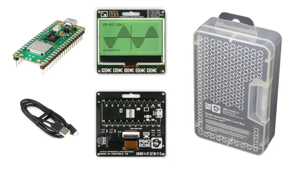
Here’s some things you’ll need to buy / download to run this on your own GFX Pack at home:
- Raspberry Pi Pico W - get the version with headers pre-soldered if you can, otherwise you’ll need to buy appropriate headers and solder them on yourself.
- Pimoroni GFX Pack.
- USB A to Micro USB power/data cable.
- Optional: Large Loot Box - a nice box to keep your project safely stored in when not using it.
- Pimoroni MicroPython build - grab the latest
pimoroni-picow-*-micropython.uf2file. - Carbon Intensity Python Software from Pimoroni’s GFX Pack examples repository.
And here’s some useful reading to learn more about the software parts of this project:
- Documentation for the National Grid Carbon Intensity API for Great Britain.
- The official MicroPython site - has information and documentation for MicroPython.
- The Thonny IDE - other development environments are available (you can use VSCode with appropriate extensions for example) but Thonny’s a nice simple all in one solution for small projects like this.
Have Fun
If you build one of these and use it, I’d love to hear from you - get in touch via my contact page or on whatever Twitter calls itself at the time of reading.
Main photograph from pxhere.com (link).
 Building the Lego Creator Land Rover Defender Set